
Responsive web page layout by display size
Between Small and Large
A desktop browser accessing the website displays both the navigation bar and the block with the text on top of each other, as shown in Figure 6. However, if the user scales the browser window down to a width of less than 640 pixels, the browser switches to mobile mode because of the adaptive CSS layout, drops the navigation element and only displays the text block (Figure 7).
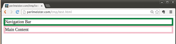 Figure 6: If the window is scaled up to more than 640 pixels, the navigation bar appears.
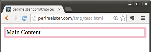 Figure 7: If the user drops the window width down to less than 640 pixels, the mobile version of the page appears on the desktop.
The 640 pixel-wide screen of, for example, an iPhone 5 also shows the mobile version without navigation aids because of the media query (Figure 8).
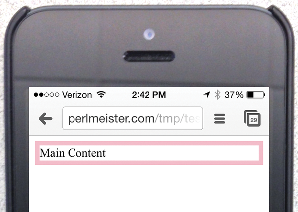 Figure 8: The mobile version shows on the iPhone 5 because of its 640-pixel page width.
The second media query in Listing 2, line 25, queries yet another display attribute. Using (orientation:landscape), it determines whether the display is in landscape mode.
If this is the case, the code from the sidebyside.css.tt file in Listing 4 is used; this shows the navigation and text elements next to one another, assigning 70 percent of space to the content and only 30 percent to navigation.
Listing 4
sidebyside.css.tt
The value for the display variable of the navigation element is set to block in Listing 5. This overwrites the value of none, which possibly occurred in the previous media query, and restores the block value initially defined in the static CSS statement block.
The browser works its way through a list of media queries from the top down and overwrites the assigned values if the specified conditions are met. As a result, both blocks appear side by side, as shown in Figure 9.
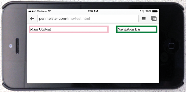 Figure 9: In landscape mode, the content and navigation bar appear side by side.
Although the first media query only allows the text block without the navigation block, the landscape query overwrites all previous settings and lines up the blocks side by side at a 70:30 ratio.
Modular System
The tpage script, courtesy of the CPAN module Template::Toolkit, builds the page from the template items,
tpage --include_path templates templates/\
  test.html.tt >test.html
thus allowing a developer-friendly modular layout with full performance on the client and server sides; no assembly of page parts at run time is required because it already happens at page creation time.
Alternatively, you could instruct the browser to load only certain external CSS pages when a given media query returns a true value. However, each loading action costs precious time – the precompiled website is more efficient at run time.
If you want to test this quickly with a web server running locally, you can do it with a short script that uses the CPAN Mojolicious::Lite module, as shown in Listing 5. The script launches a fully functional web server on port 4080 of your localhost. Browsers accessing this will display the page differently depending on whether the browser window is wide, narrow, or in landscape format. To communicate with the Template Toolkit, the script requires the Mojolicious::Plugin::TtRenderer CPAN module.
Listing 5
mojo
If you want to delve deeper into this subject, I recommend the book Responsive Web Design with HTML 5 and CSS 3 [6]. It presents a number of practical application examples and explains techniques for dynamic page layout and adjusting image sizes for various mobile and desktop devices.
Mike Schilli
Mike Schilli works as a software engineer with Yahoo! in Sunnyvale, California. He can be contacted at mailto:mschilli@perlmeister.com. Mike's homepage can be found at http://perlmeister.com.
Infos
- GitHub repository with the contents of USArundbrief.com: https://github.com/mschilli/usarundbrief
- Apple Thunderbolt display: http://www.apple.com/thunderbolt/
- "Responsive Web Design" by Ethan Marcotte, 2010: http://alistapart.com/article/responsive-web-design/
- Listings for this article: ftp://ftp.linux-magazin.com/pub/listings/magazine/166
- Device pixel density tests: http://bjango.com/articles/min-device-pixel-ratio/
- Frain, Ben. Responsive Web Design with HTML 5 and CSS 3. Packt Publishing, 2012
« Previous 1 2
Buy this article as PDF
(incl. VAT)
Buy Linux Magazine
US / Canada
UK / Australia
Subscribe to our Linux Newsletters
Find Linux and Open Source Jobs
Subscribe to our ADMIN Newsletters
Support Our Work
Linux Magazine content is made possible with support from readers like you. Please consider contributing when you’ve found an article to be beneficial.

News
-
TUXEDO Computers Unveils Linux Laptop Featuring AMD Ryzen CPU
This latest release is the first laptop to include the new CPU from Ryzen and Linux preinstalled.
-
XZ Gets the All-Clear
The back door xz vulnerability has been officially reverted for Fedora 40 and versions 38 and 39 were never affected.
-
Canonical Collaborates with Qualcomm on New Venture
This new joint effort is geared toward bringing Ubuntu and Ubuntu Core to Qualcomm-powered devices.
-
Kodi 21.0 Open-Source Entertainment Hub Released
After a year of development, the award-winning Kodi cross-platform, media center software is now available with many new additions and improvements.
-
Linux Usage Increases in Two Key Areas
If market share is your thing, you'll be happy to know that Linux is on the rise in two areas that, if they keep climbing, could have serious meaning for Linux's future.
-
Vulnerability Discovered in xz Libraries
An urgent alert for Fedora 40 has been posted and users should pay attention.
-
Canonical Bumps LTS Support to 12 years
If you're worried that your Ubuntu LTS release won't be supported long enough to last, Canonical has a surprise for you in the form of 12 years of security coverage.
-
Fedora 40 Beta Released Soon
With the official release of Fedora 40 coming in April, it's almost time to download the beta and see what's new.
-
New Pentesting Distribution to Compete with Kali Linux
SnoopGod is now available for your testing needs
-
Juno Computers Launches Another Linux Laptop
If you're looking for a powerhouse laptop that runs Ubuntu, the Juno Computers Neptune 17 v6 should be on your radar.