Responsive web page layout by display size
Feel the Width

Make your blog look good on both desktop monitors and modern smartphones with high-resolution graphics by adding CSS and media queries to change the layout on the fly.
The visuals of my USArundbrief.com blog reveal that the page layout has more than 10 years under its belt. They say that fashion trends return to the catwalk every 30 years, but I think it is unlikely that my web design will be en vogue any time soon.
I created the website back then with the Perl Template Toolkit, strictly separating the content (now on GitHub [1]) from the layout. It should not be difficult to put the site through a radical design change now.
Beyond colorful boxes with round corners and other frippery, good web design is characterized today by the ability to read content just as easily on the small screen of a cellphone as on a "thundering" desktop display [2] (Figure 1). Some site operators handle these disparate formats by creating special mobile sites to which they direct the browser once the user agent header indicates that the user is currently staring at a tiny display. The mobile pages then streamline the optical layout and omit navigation elements that users would find difficult to activate on a smartphone.
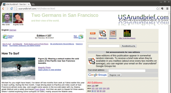 Figure 1: On a wide desktop, users expect navigation elements next to the content.
In line with the doctrine of Responsive Design, web developers should not put additional effort into special mobile sites but take a resource-saving approach. Using CSS and media queries, an HTML page reacts to the currently used display size with appropriate performance characteristics: On small screens, some navigation elements are dropped, logos shrink, and sections that normally line up side by side are stacked on top of one another.
Through the Looking Glass
One feature of smartphone browsers wreaks havoc with my blog: Despite small display sizes, they do not focus on the content the user is supposed to read, but zoom out so far that the entire width of the page is displayed. Nobody can read this on a page built for a PC display, and apparently mobile users are expected to use the pinch-out gesture to increase the font size until it is readable, and pan around in the content, like viewing it through a magnifying glass (Figure 2).
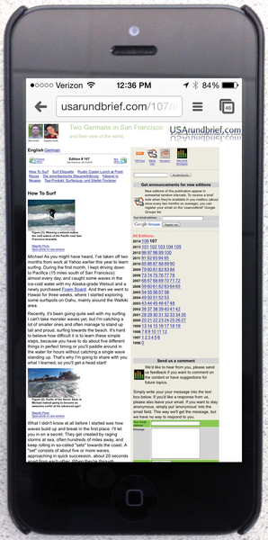 Figure 2: The iPhone displays the page from a great distance; although it appears in full width, it is illegible without zooming in by hand.
A responsive website, which serves all display sizes alike, first switches the zoom feature off. But the tag
<meta name="viewport" content=\
  "width=device-width,initial-scale=1.0">
in the header part of the HTML document now (intentionally) causes chaos on small displays (Figure 3). The navigation part on the right is cut off and the content that should be on the left is below the fold and hence invisible. Instead of seeing the content, the user is greeted by huge logos and navigation elements. One thing is clear: After this first step, the page must dynamically restructure its content after noticing a mobile phone user poking around.
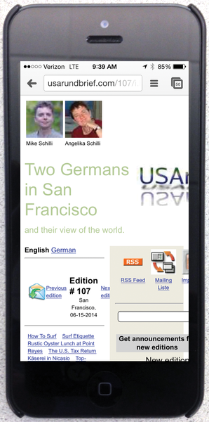 Figure 3: The HTML meta statement to the viewport suppresses the iPhone's zoom function. The result is truncated text.
The diversity of devices complicates the situation: An iPad Mini with a Retina screen has a resolution of 2,048x1,536 pixels – more than most desktop monitors of only a few years ago. Even smartphones like the HTC One achieve an amazing 1,080x1,920-pixel resolution on a diagonal of just 12 centimeters (4.7 inches). A website that selects the optimal view for a wide range of devices cannot just take the resolution of the display into account, it also needs to look at the pixel density to avoid jamming too much information in too little space.
Switching via Media Queries
As the article Responsive Web Design [3] explains, modern websites use media queries to switch the presentation. The CSS part of a page queries the width of the viewport (i.e., the current size of the browser window) and enables, disables, or moves <div> elements in the HTML to adapt the layout. This happens on the client side in the browser; the server always delivers the same page and knows nothing of the dynamic view.
Listing 1 [4] shows HTML for a page with a navigation element (ID nav) and a text part (main). The header part of the page that precedes this, which the INCLUDE statement from the Perl Template Toolkit integrates, is shown in Listing 2. It contains the viewport statement explained earlier, which disables the mobile phone zoom function; some static CSS settings; and two media queries initiated with the @media keyword that overwrite the earlier static statements – if they determine that the endpoint meets certain conditions.
Listing 1
test.html.tt
For New Browsers Only
The media query in Listing 2 (line 19) thus uses the initial command only screen and ... to specify that it only reacts to screen views (i.e., not to the print view) and uses and to tie in some additional conditions. The keyword only disables the settings for older browsers that do not understand the subsequent query.
Listing 2
header.html.tt
The max-width: 640px query matches all browser windows that are smaller than or equal to 640 pixels. It is followed by a comma, which adds a logical OR condition, which in turn also presupposes a screen condition and allows more pixels in the display width for high-resolution Retina devices. The value for -webkit-min-device-pixel-ratio [5] is 1.0 for legacy displays and 2.0 on Retina displays (Figures 4 and 5).
 Figure 4: On a desktop PC monitor, the pixel density is 1.0.
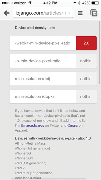 Figure 5: On an iPhone 5, the pixel density is 2.0.
On devices with small screens, whether they have high resolution or not, the media query from line 19 therefore fetches the hidenav.css.tt file (Listing 3). This sets the value for the display attribute of the div element with ID nav to none, thus preventing the navigation element from being displayed. It also assigns a value of top to the float variable for the main content item, that is, it floats the div element at the top of the window.
Listing 3
hidenav.css.tt
Between Small and Large
A desktop browser accessing the website displays both the navigation bar and the block with the text on top of each other, as shown in Figure 6. However, if the user scales the browser window down to a width of less than 640 pixels, the browser switches to mobile mode because of the adaptive CSS layout, drops the navigation element and only displays the text block (Figure 7).
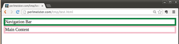 Figure 6: If the window is scaled up to more than 640 pixels, the navigation bar appears.
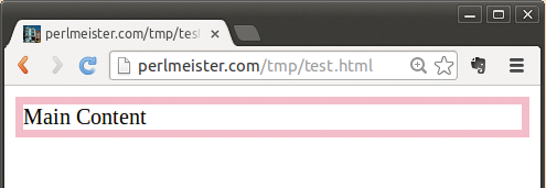 Figure 7: If the user drops the window width down to less than 640 pixels, the mobile version of the page appears on the desktop.
The 640 pixel-wide screen of, for example, an iPhone 5 also shows the mobile version without navigation aids because of the media query (Figure 8).
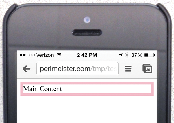 Figure 8: The mobile version shows on the iPhone 5 because of its 640-pixel page width.
The second media query in Listing 2, line 25, queries yet another display attribute. Using (orientation:landscape), it determines whether the display is in landscape mode.
If this is the case, the code from the sidebyside.css.tt file in Listing 4 is used; this shows the navigation and text elements next to one another, assigning 70 percent of space to the content and only 30 percent to navigation.
Listing 4
sidebyside.css.tt
The value for the display variable of the navigation element is set to block in Listing 5. This overwrites the value of none, which possibly occurred in the previous media query, and restores the block value initially defined in the static CSS statement block.
The browser works its way through a list of media queries from the top down and overwrites the assigned values if the specified conditions are met. As a result, both blocks appear side by side, as shown in Figure 9.
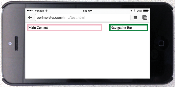 Figure 9: In landscape mode, the content and navigation bar appear side by side.
Although the first media query only allows the text block without the navigation block, the landscape query overwrites all previous settings and lines up the blocks side by side at a 70:30 ratio.
Modular System
The tpage script, courtesy of the CPAN module Template::Toolkit, builds the page from the template items,
tpage --include_path templates templates/\
  test.html.tt >test.html
thus allowing a developer-friendly modular layout with full performance on the client and server sides; no assembly of page parts at run time is required because it already happens at page creation time.
Alternatively, you could instruct the browser to load only certain external CSS pages when a given media query returns a true value. However, each loading action costs precious time – the precompiled website is more efficient at run time.
If you want to test this quickly with a web server running locally, you can do it with a short script that uses the CPAN Mojolicious::Lite module, as shown in Listing 5. The script launches a fully functional web server on port 4080 of your localhost. Browsers accessing this will display the page differently depending on whether the browser window is wide, narrow, or in landscape format. To communicate with the Template Toolkit, the script requires the Mojolicious::Plugin::TtRenderer CPAN module.
Listing 5
mojo
If you want to delve deeper into this subject, I recommend the book Responsive Web Design with HTML 5 and CSS 3 [6]. It presents a number of practical application examples and explains techniques for dynamic page layout and adjusting image sizes for various mobile and desktop devices.
Mike Schilli
Mike Schilli works as a software engineer with Yahoo! in Sunnyvale, California. He can be contacted at mailto:mschilli@perlmeister.com. Mike's homepage can be found at http://perlmeister.com.
Infos
- GitHub repository with the contents of USArundbrief.com: https://github.com/mschilli/usarundbrief
- Apple Thunderbolt display: http://www.apple.com/thunderbolt/
- "Responsive Web Design" by Ethan Marcotte, 2010: http://alistapart.com/article/responsive-web-design/
- Listings for this article: ftp://ftp.linux-magazin.com/pub/listings/magazine/166
- Device pixel density tests: http://bjango.com/articles/min-device-pixel-ratio/
- Frain, Ben. Responsive Web Design with HTML 5 and CSS 3. Packt Publishing, 2012