Aligning Text in LibreOffice Writer

Ducks in a Row

© synell, 123RF.com

© synell, 123RF.com

Author(s):

To get professional publishing results, here are a few tips and tricks to get the most out of LibreOffice Writer’s alignment options.

Just because an option in LibreOffice Writer is easy to choose does not mean that it is easy to use. Take, for example, alignment, or how characters are arranged between the left and the right margin on a line. A single click on the Alignment tab of a paragraph style will set the alignment to right, center, left (ragged right), or justified (i.e., evenly distributed between the margins). Yet to use any alignment takes design knowledge and, sometimes, extra effort as well (Figure 1).

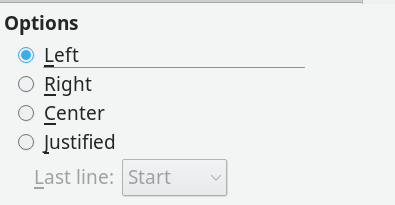
Figure 1: LibreOffice Writer offers four alignment choices.

Right Alignment

Aligning letters to the right margin is used the least. Right alignment is used only in layout, such as a title page. A basic rule of layout is that related information, such as the lines of a mailing address should have a common alignment. For instance, an address on a letter is traditionally right aligned. You often find a right alignment on a brochure or diagram as well. Generally, though, only a few lines in a document are likely to have a right alignment, for the simple reason that most European languages read from left to right, and an uneven left margin is harder to read and just looks wrong to most people.

Center Alignment

In the long gone, unlamented days of typewriters, titles were often center aligned, for the simple reason that the options for differentiating the title from the main text were few. Today, however, a title can easily be a different size or font, and a center alignment, like a right one, is only seen in more elaborate layouts.

Left vs. Justified Alignment

Left and justified alignments are the most common choices in layout. However, which one to use depends on the context.

For decades, left alignment was the default on typewriters. Only late model typewriters with a few kilobytes of memory ever managed justified lines. For the most part, industrial typesetting machines alone offered justification -- and even they often required manual tweaks to look their best. Consequently, in many people’s minds, justification is still the main indicator of professional design. Armed with this expectation, today many can be loudly scornful of left alignment.

However, for professional typographers, the choice is more complicated. To start with, the algorithms for justifying lines of text can be very poor, and heavy editing and revision can leave justified lines a mess with unsightly variations in the spaces between characters and words. You can see a small sample of the difficulties by investigating Writer’s options for the last line of a justified paragraph: Start (left-aligned), Center, and Justified. To be fair, some tools, including Writer, have improved greatly over the years, but, in others, users are better off avoiding justification altogether.

Yet even in Writer, justification is not always the best choice. Faced with short sentences, such as an instruction manual with numbered steps or a table with narrow columns, justification can struggle to produce a decent-looking page (Figure 2). Sometimes, a change of fonts, font size, or character spacing on the Position tab helps, but too often such modifications can compromise the overall look of the design by introducing too many changes in the default appearance. Sometimes, a left alignment may also be unsuitable (Figure 3), yet, by contrast, a left alignment tends to look better than justification, even before tweaking. Just as importantly, if a document will be frequently revised, then a left alignment can mean less maintenance. Besides, some designers will deliberately use a left alignment simply out of nostalgia for typewriters. Fortunately, the great advantage of word processors is that changes are easily made, so you can experiment until you find the best alignment for your purposes and aesthetics.

Figure 2: In this three column layout, justification has such an irregular spacing, it is hard to see where a new column begins.


Figure 3: Here, a left alignment produces too many hyphens and lines with only a single word. The font is probably too large.

Tools for Tweaking the Alignment

Writer aligns text on the fly. It does its best (and usually it is a very good best), but it cannot always keep up with unforeseen circumstances or the changes inflicted by revisions. For this reason, you may need to tweak the alignment before you publish.

A useful place to start is with the font for your main paragraph styles.The spaces between letters are small, and sometimes minor changes in font or font size can be enough to improve the look of your chosen alignment. Using points as the measurement, you can adjust font size to one decimal place, or 1/720th of an inch, which should be more than enough.

Another alignment-tweaking tool is in the hyphenation settings on the Text Flow tab of a Paragraph dialog box (Figure 4). Simply turning on hyphenation can improve the alignment, because it gives the alignment algorithm more flexibility in making line breaks -- just remember that more than two lines ending in a hyphen are considered too many in typography.The settings for the number of letters at the end or start of the line can also aid the alignment.

Figure 4: Hyphenation settings can improve the result of alignment.

However, as professional typesetters have known for centuries, the most effective way to improve alignment is manual. Many of the languages supported by LibreOffice include hyphenation dictionaries. English in particular is available for several localizations. If one localization does not have a hyphenation dictionary, another will that can be used with only minimal caution. Make sure a hyphenation dictionary is installed for the current document’s language, and select Tools | Language | Hyphenation. The Hyphenation dialog box opens, which gives you the option of changing all the places where hyphenation might be improved ( a possibly rash decision) or to go through every instance, letting you chose where hyphenation falls. This is a potentially tedious task, but may be worthwhile in some cases (Figure 5). If you see a line end where no hyphen is indicated, but you want to keep two words together, press Ctrl+Shift when entering the space between the word to insert a soft hyphen. Later on, if you want to find such instances, click Tools | Options | Writer | Formatting Aids | Soft Hyphens. The soften hyphen appears as a gray bar between the words.

Figure 5: You can manually tweak line alignments from the Hyphenation dialog box.

Hidden Professionalism

As you can see, looks can be deceptive. Choosing a text alignment seems like a minor choice, but it is more than a matter of whim. Behind this choice lies centuries of design convention and practical choices.You may not want to worry about this for a single-use document. However, if layout matters, Writer can accommodate you. Although Writer’s layout tools are often overlooked, with them you can easily create a Writer document that meets professional publishing standards.