Reading data from GPS devices
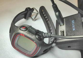
A few years ago, portable GPS devices looked more like the clunky cellphones of the early 1990s. Today, athletes no longer need to drag along that much extra weight, as devices like the Garmin Forerunner 10 [1] have shrunk to the size of digital LED watches from the 1970s (Figure 1). These ultimate sports accessories log geographic coordinates during runs.
 Figure 1: The wristwatch-sized GPS receiver logs the coordinates of points on the route traveled with timestamps.
Thus, runners can see how fast they are currently traveling and whether they need to speed up or slow down to achieve their own time goals. After completing all of this muscular activity, runners can then enjoy the experience of logging new speed records, viewing the running route on a map, reviewing the miles traveled, or marveling at an altitude profile of the route.
[...]
Buy this article as PDF
(incl. VAT)
Buy Linux Magazine
Subscribe to our Linux Newsletters
Find Linux and Open Source Jobs
Subscribe to our ADMIN Newsletters
Support Our Work
Linux Magazine content is made possible with support from readers like you. Please consider contributing when you’ve found an article to be beneficial.

News
-
Another Linux Malware Discovered
Russian hackers use Hyper-V to hide malware within Linux virtual machines.
-
TUXEDO Computers Announces a New InfinityBook
TUXEDO Computers is at it again with a new InfinityBook that will meet your professional and gaming needs.
-
SUSE Dives into the Agentic AI Pool
SUSE becomes the first open source company to adopt agentic AI with SUSE Enterprise Linux 16.
-
Linux Now Runs Most Windows Games
The latest data shows that nearly 90 percent of Windows games can be played on Linux.
-
Fedora 43 Has Finally Landed
The Fedora Linux developers have announced their latest release, Fedora 43.
-
KDE Unleashes Plasma 6.5
The Plasma 6.5 desktop environment is now available with new features, improvements, and the usual bug fixes.
-
Xubuntu Site Possibly Hacked
It appears that the Xubuntu site was hacked and briefly served up a malicious ZIP file from its download page.
-
LMDE 7 Now Available
Linux Mint Debian Edition, version 7, has been officially released and is based on upstream Debian.
-
Linux Kernel 6.16 Reaches EOL
Linux kernel 6.16 has reached its end of life, which means you'll need to upgrade to the next stable release, Linux kernel 6.17.
-
Amazon Ditches Android for a Linux-Based OS
Amazon has migrated from Android to the Linux-based Vega OS for its Fire TV.

