
LibreOffice: how to avoid manufactured font weights

Off the Beat: Bruce Byfield's Blog
LibreOffice does it. Calligra Suite and Abiword do, too. In fact almost all the word processors you ever used will manufacture bold and italic weights as well as small caps when no font metrics are available. Fortunately, you can work around this over-helpfulness, but you have to be aware of what is happening.
For reasons still unclear to me, LibreOffice varies in its detection of font files. It is not, as I first thought, simply a question of whether font metrics for different weights are stored in one file or several. However, I do know that if you have different weights installed but the toolbar's list of fonts gives only the family name, nothing should be manufactured. By contrast, if the files for some weights are missing, or the weights have separate entries in the font list, then bold and italic weights are manufactured.
As for small capitals, they are usually manufactured whenever small capitals are not included in the font. In the past, I have sometimes seen small caps as a separate entry in the font list, but that seems to have disappeared in recent releases. If small caps are still listed separately for any font, then LibreOffice would presumably manufacture small caps instead of using the real ones.
What's wrong with manufactured fonts?
At first, manufactured weights might seem a benefit. Surely, you might say, they are better than not having the weights available at all?
However, there are at least two reasons for avoiding the use of manufactured fonts.
First, manufactured fonts mean that users are not seeing the font as the designer intended. Font design may be a minor art form, but distorting the design of a font is similar to placing a painting of Van Gogh in a dark corner where his perception of light is hidden by the dimness, or using Auto-Tune in a recording of a singer with a four octave vocal range. If you like a font well enough to use it, you should at least treat its designs with respect.
Most important of all, however, is that manufactured results are almost always a mess. Thickness of character, letter shape, and spacing are jarringly irregular.
Figure 1, for example, shows examples of a manufactured bold weight for the free-licensed font Nobile. The manufactured weight at the top shows none of the subtlety of design of the true bold weight for Nobile, shown at the bottom. The manufactured weight cannot even get the angle right at the top of the "b" and the "d."
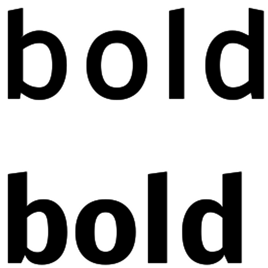
Figure 1
Even worse is the manufactured Nobile Italic weight at the top of figure 2. It not only gets the lower case "a" completely wrong, but the angle of the italic is extreme enough to cause reading problems. In fact, I consider the manufactured italic unusable.
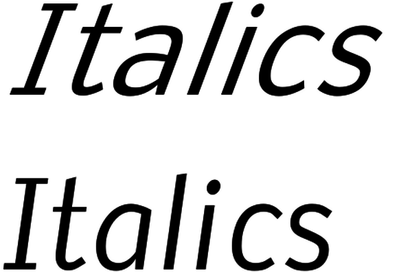
Figure 2
However, by far the worst example is the manufactured small capitals in figure 3. They look nothing like the true small caps -- in fact, they could almost be regular capitals by their size, and are hardly worth using.

Figure 3
These examples are all created using LibreOffice. Abiword and Calligra Suite give different results for manufactured weights, but none are significantly better or worse than the ones shown.
What digital typography obscures is that changing the weight of a font is not as easy as a click of the button. In pre-computer typography, even the change in the size of a font was seen as reason to adjust the proportions of individual characters, and adjusting a weight was that much more complicated. Such adjustments are as much an art as a science, and the ability to manufacture different weights would have to be much more sophisticated than it has ever been in any word processor to produce adequate manufactured fonts in even most circumstances. At the very least, the challenge is complicated enough that no one has ever tackled it.
Avoiding manufactured fonts
Anyone who respects artists and cares about the look of their documents should avoid manufactured fonts at all costs. When designing a document, check whether your chosen faults have entries for different weights in LibreOffice's font list.
If they do, avoid creating different weights from the toolbar icons or the Character dialogue window, regardless of whether you are using manual or stylistic formatting.
Instead, create separate character styles for each weight you use. You can create your own styles, or use Emphasis for italics, Strong Emphasis for bold, and Placeholder for small caps. If you always use these character styles, and never change weights from the Regular or Roman version of the font, then manufactured weights should never haunt you.
Follow these guidelines, and manufactured fonts will never create design problems for you. You can forget these relics, consigning them to the oblivion that they deserve.
comments powered by DisqusSubscribe to our Linux Newsletters
Find Linux and Open Source Jobs
Subscribe to our ADMIN Newsletters
Support Our Work
Linux Magazine content is made possible with support from readers like you. Please consider contributing when you’ve found an article to be beneficial.

News
-
Substantial Update to IPFire Now Available
The lastest version of IPFire features a fundamental change to how the system handles DNS.
-
Gnome Working on Test Center App to Make Testing Easier
It's now possible to test experimental features on the Gnome desktop without worrying that you'll break things.
-
New Vulnerability Discovered in Linux Kernel
Hiding out for nearly 15 years, the Ghostlock vulnerability allows a standard logged-in user to gain root privileges.
-
New Linux Flaw Lets Attackers Escape VMs
A 16-year-old vulnerability allows an attacker to escape a virtual machine, gain access to the host, and execute malicious code.
-
Hannah Montana Linux Is Back!
Developer Noah Cagle decided the world needed the once obscure but beloved Linux distribution and gave it a decidedly pink refresh.
-
System76 Refreshes the Lemur Laptop
If you're looking for a laptop with tons of power and battery, look no further than the latest iteration of the System76 Lemur Pro.
-
More than 43 Million Lines of Code in Linux Kernel 7.2
Using the cloc utility, Michael Larabel of Phoronix discovered that Linux kernel 7.2 has over 43 million lines of code.
-
Kubuntu Focus Goes Ultra
The Kubuntu Focus team has upped the performance ante of its M2 and Zr laptops with the latest, greatest CPUs from Intel.
-
Linux Gamers May Soon See Less Mouse Lag in KDE Plasma
Gamers using KDE’s Plasma desktop have been suffering from a slight input delay in mouse movement that could lead to getting fragged.
-
Three Lines of Code Improve Linux Storage Performance
A developer changed three lines of code, giving Linux storage performance a 5% bump.