
Draw Google diagrams from a Perl script
Very few people are seen with Windows laptops at open source conferences nowadays, unless, that is, they really want to be the center of attraction as stone age cave dwellers. For a while, I had been looking around to replace my old laptop when an offering by Dell caught my eye: a cute Mini 9 Ubuntu netbook at an unbeatable price of US$ 230 (Figure 1). So I finally made the move. Leif, a guy from work, even gave the cute gadget a funny nickname, "Mini-Me," after the tiny clone of Dr. Evil in the second Austin Powers movie.
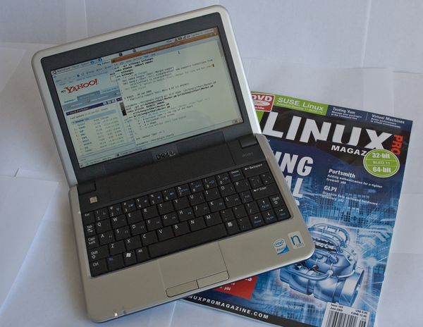 Figure 1: The tiny Dell netbook with Ubuntu.
My first impression was exhilarating; aside from some weird issues with ssh and the wireless driver, which I could resolve online, it actually worked! I then went on to replace the meager 512MB RAM with 2GB from a no-name supplier for just US$ 9.95. But soon after, I got suspicious: Would the netbook now consume more power in suspend mode and prematurely discharge the battery? Being an engineer by trade, I had to investigate.
[...]
Buy Linux Magazine
Subscribe to our Linux Newsletters
Find Linux and Open Source Jobs
Subscribe to our ADMIN Newsletters
Support Our Work
Linux Magazine content is made possible with support from readers like you. Please consider contributing when you’ve found an article to be beneficial.

News
-
Linux Foundation Report Indicates AI Driving Tech Hiring
Within growing security and skills gaps, AI has been found to be a positive driving force behind tech hiring trends in Europe.
-
United Nations Open Source Portal Goes Live
A new open source portal seeks to coordinate and scale open source efforts across the United Nations system.
-
KDE Linux Drops AUR
KDE Linux developers have dropped the Arch User Repository from the build pipeline due to security concerns; other distributions should consider doing the same.
-
California May Exempt Linux from Its Age-Verification Law
After backlash from the Linux community, California may be backing off on its promise to force all operating systems to verify age, but one platform may still have to comply.
-
Another Logic Bug Found in Linux Kernel
Qualys has discovered a vulnerability in the Linux kernel that can be used to elevate standard user privileges.
-
Ubuntu Core 26 Offers Game-Changing Enterprise Features
Ubuntu Core 26 could be a game-changer for organizations looking for increased security and reliability.
-
AI Flooding the Linux Kernel Security Mailing List
AI is giving Linus Torvalds a headache, but not in the way you might think.
-
Top Priorities for Open Source Pros Seeking a New Job
Professional fulfillment tops the list, according to LPI report.
-
Container-Based Fedora Hummingbird Designed for Agent-First Builders
Fedora Hummingbird brings the same approach to the host OS as it does to containers to level up security.
-
Linux kernel Developers Considering a Kill Switch
With the rise of Linux vulnerabilities, the kernel developers are now considering adding a component that could help temporarily mitigate against them… in the form of a kill switch.