
A plotting library
Reading Data from a CSV File
You can use Matplotlib plots to visualize data created in another program and saved as a file, often as plain text in comma-separated values (CSV) format, such as csv-data.csv in Listing 4.
Listing 4
csv-data.csv
John,32
Mary,48
Ashok,25
Mario,41
Heather,38
Ashley,29
Figure 3 shows the data from the CSV file in Listing 4 in a histogram format. To create the histogram with Matplotlib, you can use the code in Listing 5 – after loading Matplotlib and another module (csv) to hande CSV data. Listing 5 creates two arrays, x and y (lines 4 and 5), and opens the data file (line 7). Lines 8-12 load the file's contents into a table called plots (using the comma as a column separator), copy the names from the first column into the x array and the ages (reformatted as integer numbers) into the y array. The rest of Listing 5 is self-explanatory, because each line corresponds to a specific, easy-to-spot visual feature in Figure 3.
Listing 5
Plotting Data from a CSV File
01 import Matplotlib.pyplot as plt
02 import csv
03
04 x = []
05 y = []
06
07 with open('csv-data.csv','r') as csvfile:
08 plots = csv.reader(csvfile, delimiter = ',')
09
10 for row in plots:
11 x.append(row[0])
12 y.append(int(row[1]))
13
14 plt.bar(x, y, color = 'g', width = 0.72, label = "Age")
15 plt.xlabel('Names')
16 plt.ylabel('Ages')
17 plt.title('Customers ages')
18 plt.legend()
19 plt.savefig('03-csv.png')
20 plt.show()
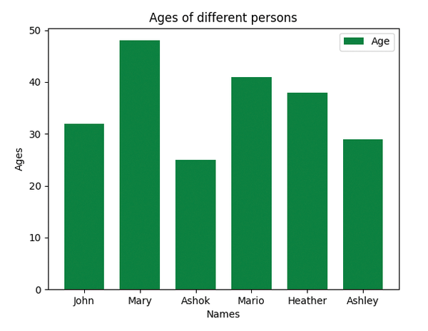 Figure 3: You can also plot data from a CSV file generated by another program.
A Random Data, Scattered Plot
While an in-depth overview of NumPy's capabilities is beyond the scope of this tutorial, Figure 4 gives an idea of the possibilities of using Matplotlib and NumPy together. The scatter plot in Figure 4 is generated from the code in Listing 6, which is taken (with minimal changes) from the official Matplotlib documentation. For my purposes, I will divide the code into two sections and discuss them in reverse order. The last section (lines 11-15) draws and saves a series of distinct points, scattered in random positions across the Axes. The coordinates, size, and color of each point are loaded in line 12 by the powerful pyplot function scatter (see [6] for an explanation of scatter syntax). The interesting part of Listing 6 is how all the arrays of values passed to scatter are generated. It is easy to guess, by looking at lines 4-9, that all those arrays are generated randomly, on the spot, with simple calls to the NumPy functions that generate random numbers. For the settings of those functions, please see the documentation for these functions on the NumPy website [4].
Listing 6
Scattered, Random Data
01 import Matplotlib.pyplot as plt
02 import NumPy as np
03
04 np.random.seed(20010911)
05 data = {'a': np.arange(50),
06 'c': np.random.randint(0, 50, 50),
07 'd': np.random.randn(50)}
08 data['b'] = data['a'] + 10000 * np.random.randn(50)
09 data['d'] = np.abs(data['d']) * 100
10
11 fig, ax = plt.subplots(figsize=(5, 2.7))
12 ax.scatter('a', 'b', c='c', s='d', data=data)
13 ax.set_xlabel('Speed')
14 ax.set_ylabel('Distance');
15 plt.savefig('random-scatter.png')
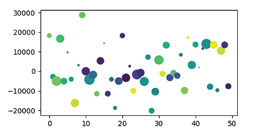 Figure 4: A scatter plot, showing the distribution and weights of a generic dataset.
Subplots and Extra Axes
You can combine different plots into one Matplotlib Figure, add Axis elements, and link them to each other using the techniques in Listing 7.
Listing 7
Connecting Subplots
01 import Matplotlib.pyplot as pls
02 import NumPy as np
03
04 t = np.arange(0.0, 40.0, 0.8)
05 s = t**2 #parabola
06
07 fig, (ax1, ax3) = plt.subplots(1, 2, figsize=(12, 5))
08 l1, = ax1.plot(t, s)
09 ax2 = ax1.twinx()
10 l2, = ax2.plot(t, np.cos(-1*t/2), 'C1')
11 ax2.legend([l1, l2], ['Parabola (left)', 'Sinusoid (right)'])
12
13 ax3.plot(t, 20 - t*np.sin(20 - t))
14 ax3.set_xlabel('Angle [∞]')
15
16 ax4 = ax3.secondary_xaxis('top', functions=(np.rad2deg, np.deg2rad))
17 ax4.set_xlabel('Angle [rad]')
18
19 plt.savefig('extra-axes.png')
Using more or less the same syntax shown in the previous examples, Listing 7 creates three distinct functions: a parabola (lines 5 and 8), a normal sinusoid (line 11), and a growing sinusoid (line 13). What is new is that these plots are grouped into two subplots (shown in Figure 5), whose Axis objects are indeed linked to each other. A full explanation of the code is beyond the scope of this article, but here are the main points you need to understand to create similar charts.
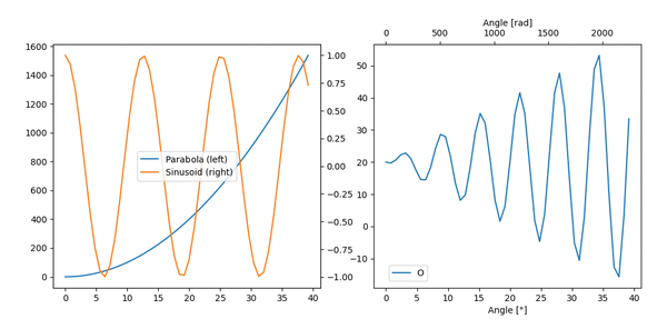 Figure 5: Plots can be combined in many ways with extra Axes that make them easier to read.
Line 7 splits the main Figure into two subplots, each with its own Axes, called ax1 and ax3. Then, the first subplot gets the ax2 of line 9, which is a "twin" of the ax1 of line 8, for a very precise purpose: to show the very different scales of both the parabola and the sinusoid separately, but as clearly as possible, on opposite sides of the subplot. Meanwhile, the growing sinusoid is plotted in the right subplot, with its own labels and titles, but also using another feature of Matplotlib (line 16): the secondary_xaxis method creates an extra horizontal Axis (ax4) at the top of that subplot that shows the same variable as the bottom Axis (ax3) but with a different unit (radiants instead of degrees).
Buy this article as PDF
(incl. VAT)
Buy Linux Magazine
US / Canada
UK / Australia
Subscribe to our Linux Newsletters
Find Linux and Open Source Jobs
Subscribe to our ADMIN Newsletters
Support Our Work
Linux Magazine content is made possible with support from readers like you. Please consider contributing when you’ve found an article to be beneficial.

News
-
Endless OS 6 has Arrived
After more than a year since the last update, the latest release of Endless OS is now available for general usage.
-
Fedora Asahi 40 Remix Available for Macs with Apple Silicon
If you've been anticipating KDE's Plasma 6 for your Apple Silicon-powered Mac, then you're in luck.
-
Red Hat Adds New Deployment Option for Enterprise Linux Platforms
Red Hat has re-imagined enterprise Linux for an AI future with Image Mode.
-
OSJH and LPI Release 2024 Open Source Pros Job Survey Results
See what open source professionals look for in a new role.
-
Proton 9.0-1 Released to Improve Gaming with Steam
The latest release of Proton 9 adds several improvements and fixes an issue that has been problematic for Linux users.
-
So Long Neofetch and Thanks for the Info
Today is a day that every Linux user who enjoys bragging about their system(s) will mourn, as Neofetch has come to an end.
-
Ubuntu 24.04 Comes with a “Flaw"
If you're thinking you might want to upgrade from your current Ubuntu release to the latest, there's something you might want to consider before doing so.
-
Canonical Releases Ubuntu 24.04
After a brief pause because of the XZ vulnerability, Ubuntu 24.04 is now available for install.
-
Linux Servers Targeted by Akira Ransomware
A group of bad actors who have already extorted $42 million have their sights set on the Linux platform.
-
TUXEDO Computers Unveils Linux Laptop Featuring AMD Ryzen CPU
This latest release is the first laptop to include the new CPU from Ryzen and Linux preinstalled.