
Draw Google diagrams from a Perl script
Painting by Data

A CPAN module passes drawing instructions in object-oriented Perl to Google Chart, which draws visually attractive diagrams.
Very few people are seen with Windows laptops at open source conferences nowadays, unless, that is, they really want to be the center of attraction as stone age cave dwellers. For a while, I had been looking around to replace my old laptop when an offering by Dell caught my eye: a cute Mini 9 Ubuntu netbook at an unbeatable price of US$ 230 (Figure 1). So I finally made the move. Leif, a guy from work, even gave the cute gadget a funny nickname, "Mini-Me," after the tiny clone of Dr. Evil in the second Austin Powers movie.
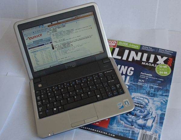 Figure 1: The tiny Dell netbook with Ubuntu.
My first impression was exhilarating; aside from some weird issues with ssh and the wireless driver, which I could resolve online, it actually worked! I then went on to replace the meager 512MB RAM with 2GB from a no-name supplier for just US$ 9.95. But soon after, I got suspicious: Would the netbook now consume more power in suspend mode and prematurely discharge the battery? Being an engineer by trade, I had to investigate.
[...]
Buy Linux Magazine
Subscribe to our Linux Newsletters
Find Linux and Open Source Jobs
Subscribe to our ADMIN Newsletters
Support Our Work
Linux Magazine content is made possible with support from readers like you. Please consider contributing when you’ve found an article to be beneficial.

News
-
Substantial Update to IPFire Now Available
The lastest version of IPFire features a fundamental change to how the system handles DNS.
-
Gnome Working on Test Center App to Make Testing Easier
It's now possible to test experimental features on the Gnome desktop without worrying that you'll break things.
-
New Vulnerability Discovered in Linux Kernel
Hiding out for nearly 15 years, the Ghostlock vulnerability allows a standard logged-in user to gain root privileges.
-
New Linux Flaw Lets Attackers Escape VMs
A 16-year-old vulnerability allows an attacker to escape a virtual machine, gain access to the host, and execute malicious code.
-
Hannah Montana Linux Is Back!
Developer Noah Cagle decided the world needed the once obscure but beloved Linux distribution and gave it a decidedly pink refresh.
-
System76 Refreshes the Lemur Laptop
If you're looking for a laptop with tons of power and battery, look no further than the latest iteration of the System76 Lemur Pro.
-
More than 43 Million Lines of Code in Linux Kernel 7.2
Using the cloc utility, Michael Larabel of Phoronix discovered that Linux kernel 7.2 has over 43 million lines of code.
-
Kubuntu Focus Goes Ultra
The Kubuntu Focus team has upped the performance ante of its M2 and Zr laptops with the latest, greatest CPUs from Intel.
-
Linux Gamers May Soon See Less Mouse Lag in KDE Plasma
Gamers using KDE’s Plasma desktop have been suffering from a slight input delay in mouse movement that could lead to getting fragged.
-
Three Lines of Code Improve Linux Storage Performance
A developer changed three lines of code, giving Linux storage performance a 5% bump.