
Nine Free-Licensed Serif Fonts

Off the Beat: Bruce Byfield's Blog
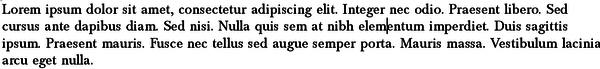
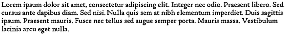
When many people think of fonts, they think of decorative fonts that call attention to themselves. However, the fonts that are in greatest demand are the workday ones, especially those for setting the main body of text. Especially in North America, most of those are serif fonts, whose characters often end with a hook or serif at the end of their lines.
The number of free-licensed serif fonts now number in the hundreds, still far fewer than proprietary serifs, but growing constantly. Many are based on proprietary or classic fonts, but original designs are also becoming common. If some seem conservative, they are designed that way -- the whole point of body text fonts is to make the content inviting and readable without being noticed themselves
Here are nine free-licensed serifs suitable for almost all occasions, along with some suggestions about how to use them:
Baskervald ADF Std
Baskervald is the most successful of the free fonts based on Baskerville, the most popular font from the eighteenth century. Both are formal and elegant, and add dignity to a subject. With a font size of 12 points, they are slightly small, so you can easily bump up the size to fourteen points to make their affect more obvious without adding too many lines to your manuscript.
Coelacanth
Coelecanth is inspired by the popular Centaur, itself inspired by the work of Renaissance typographers. You can see the Renaissance inspiration in the slanted cross-bar of the lower case "e." The thin lines saves Coelacanth from being dark and heavy, while giving a stylish informality suitable for informal subjects, children's books, or poetry. On the screen, Coelacanth's lines are so thin that they risk disappearing.
EB Garamond

Garamond is a generic name for fonts inspired by the designs of Claude Garamond in the 16th century. These fonts vary so much that they are rarely interchangable. EB Garamond is characterized by small bowls in letters like "e," a small "t" and long tails on the letter "y." It is an unobtrusive font that can be used for almost any purpose.
Fanwood
Fanwood bears a distinct resemblance to Joanna, a popular font designed by English sculptor and typographer Eric Gill. It is suitable for almost any subject, but not ideal at sizes below 12 points because its letters are short and closely spaced. A variant called Fanwood Text is darker and designed for on-line reading.
Goudy Bookletter 1910
Frederick Goudy was an American typography of the early twentieth century. Many of his designs have not been picked up by proprietary font designers but Barry Schwartz, who also created Fanwood, has created several Goudy-inspired fonts. Of these, Goudy Bookletter 1910 is the most versatile and readable, although it looks slightly old-fashioned.
Josefin Slab
A slab serif is a serif with large serifs. Many examples of slab serifs look massive and unsubtle, but Josefin Slab manages a light appearance, perhaps because of the height of letters like "l" which are almost twice the height of letters like "m" or "x." The Demibold and Bold weights are too dark to be easily used, but the lightness works very well with the Italics. Josefin Sans makes a good match for it.
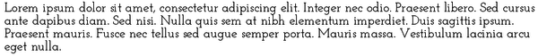
Merriweather
Without being a copy, Merriweather reminds of Century School Book. It is a large, unassuming font -- so large, in fact, that it requires an extra point or two of line-spacing to avoid looking crowded.
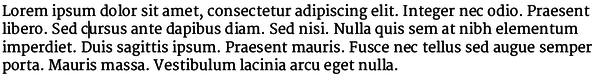
Quattrocento Roman

Quattrocento Roman is an understated font that many users seem to have overlooked. It is distinguished by extremely round letter forms whose strokes are largely the same width -- traits that make it highly readable. Versatile in itself, it is enhanced even more when accompanied by Quattrocento Sans. I would add a point or two to the default line spacing.
Romande ADF St.
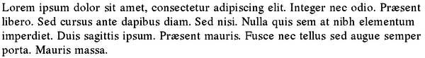
Romande is not a font to use at 12 points or less. However, at 14 points, it becomes an almost perfect Renaissance-inspired design. Unlike many fonts, its default line spacing and color need no adjustment. Its bold weight is less dark than many, but avoid using its mediocre italic weight .
Other choices
These nine are among the most versatile free-licensed serif fonts. Some just miss being in my personal favorites, such as Heuristica or Lora. Others are suitable for limited specialized purposes, such as Prociano, which gives an impression of German black letter characters without actually using any, or Gentium, which has a handwritten appearance. More are coming every month, if not every week.
What is exciting about these designs is that they allow designers to work entirely with free-licensed fonts -- something that was impossible five years ago.
Subscribe to our Linux Newsletters
Find Linux and Open Source Jobs
Subscribe to our ADMIN Newsletters
Support Our Work
Linux Magazine content is made possible with support from readers like you. Please consider contributing when you’ve found an article to be beneficial.

News
-
Three Lines of Code Improve Linux Storage Performance
A developer changed three lines of code, giving Linux storage performance a 5% bump.
-
AUR Hit Again with Malicious Packages
Once again the Arch User Repository is plagued by a high volume of malicious packages.
-
Alpine Linux 3.24 Features Fresh Desktops and a Newer Kernel
If you're a fan of Alpine Linux, it's time to upgrade because the latest version has been released with KDE Plasma 6.6, Gnome 50, and Linux kernel 6.18 LTS.
-
EU Open Source Strategy Plays Key Role in Tech Sovereignty Package
Comprehensive measures adopted by the European Commission aim to reduce dependency on non-EU countries.
-
Linux Foundation Report Indicates AI Driving Tech Hiring
Within growing security and skills gaps, AI has been found to be a positive driving force behind tech hiring trends in Europe.
-
United Nations Open Source Portal Goes Live
A new open source portal seeks to coordinate and scale open source efforts across the United Nations system.
-
KDE Linux Drops AUR
KDE Linux developers have dropped the Arch User Repository from the build pipeline due to security concerns; other distributions should consider doing the same.
-
California May Exempt Linux from Its Age-Verification Law
After backlash from the Linux community, California may be backing off on its promise to force all operating systems to verify age, but one platform may still have to comply.
-
Another Logic Bug Found in Linux Kernel
Qualys has discovered a vulnerability in the Linux kernel that can be used to elevate standard user privileges.
-
Ubuntu Core 26 Offers Game-Changing Enterprise Features
Ubuntu Core 26 could be a game-changer for organizations looking for increased security and reliability.