Making the most out of Cascading Style Sheets
Command Line – CSS
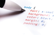
Cascading Style Sheets can provide a sophisticated layout for articles and books. Here are a few tips to get you started.
If you have created HTML or JavaScript in the last two decades, you probably have a nodding familiarity with Cascading Style Sheets (CSS) [1]. Not only is the CSS stylesheet language commonplace on the Internet, but popular ebook formats like EPUB and MOBI use it as well. Moreover, because CSS is human-readable, if you know English, you can understand much of what is being done without learning the details. However, a formal look at CSS is likely to reveal missed details, not least of which is the number of options it provides.
CSS keeps format and content separate. Initially, markup languages like HTML were designed to do the same, but the distinction became blurred (if you are old enough, you may remember the infamous HTML blink tab). CSS was intended to restore the distinction by being a stylesheet that gave designers control over how pages are viewed. CSS has been only partly successful, because different web browsers continue to display some elements differently and to allow readers to override CSS with their own preferences. All the same, CSS remains popular, if only because most designers prefer to have some formatting control.
At any rate, CSS continues to be a standard feature of modern computing. Its specifications are developed and maintained by the World Wide Web Consortium (W3C), which also provides a CSS validation service [2]. However, be aware that different CSS uses, such as ebook publication on Amazon or Lulu, often have their own, sometimes arbitrary, standards for CSS stylesheets. A given stylesheet can be valid by W3C standards yet still fail to be accepted by a given publisher. It's time, though, for a closer look at CSS constructions.
Establishing Rules
A CSS stylesheet is analogous to a collection of styles in a word processor. Making a change in an element listed in a stylesheet changes all instances of that element in a document using that element. You might also choose to have different stylesheets for different page types to keep such structures as simple as possible. For example, you could have a paragraph style in both a copyright page and a body text page but format them differently by having the pages use a different stylesheet.
A stylesheet is a series of rules about formatting different text elements. For the convenience of humans – including you when you edit – the stylesheet usually adds an extra space between each rule. The basic format for a rule is:
SELECTOR {DECLARATION;}
The SELECTOR
is the element to which the rule applies, and the DECLARATION
is the formatting choice(s) that make(s) up the rule.
The selector can take several forms. The simplest is an HTML element, such as h2
(heading 2). It may or may not be followed by a class of the h2
tag, marked by a period. For instance,
h2 .example, h2, h3
would be a complete selector. You could add other selectors in a comma-separated list.
Alternatively, the selector can refer to a non-standard element named in the file that makes use of the stylesheet, with <class="NAME">
. If the file uses <div>
, then before the end of the section marked with </div>
, you could also add <id="NAME>
. You could also do the same with a section marked with a <span>
tag. Strictly speaking, a span tag is supposed to be used like a character style to mark a nested selection to be formatted differently, but in practice, the distinction between <div>
and <span>
is not always observed. Since both function in the same way, the distinction is blurred.
The declaration follows the selector inside curly brackets. The declaration begins with the property, followed by the setting for the property, and ending with a semicolon. You could make a separate rule for each property, but to save space, you can place a semicolon-separated list of properties within the same curly brackets. So the complete rule might be:
h2 .example, h2, h3 {color:green; weight:bold;font:Liberation Sans;}
If you want the stylesheet to be easily readable, you can take advantage of the fact that CSS ignores white space and separate properties by lines, so that the same example can be formatted as:
h2 .example, h2, h3 { color:green; weight:bold; font:Liberation Sans; }
No matter how you format the rule, the punctuation is simple but essential, so check it carefully.
CSS Positioning
Sometimes, CSS rules are used locally within a file where the formatting is needed. Because browsers generally can read a valid piece of CSS, this positioning is practical when a file has very few sections that require special formatting. However, this is like manual formatting in a word processor: Both are cumbersome when you make changes while editing.
More often, CSS rules are used globally, where any changes only have to be made once. One choice is to place CSS in the <head>
section of an HTML file (Listing 1). This location reduces the work and has the advantage of only requiring that you keep track of a single file.
Listing 1
CSS Placement
<html> <head> <style type="text/css> h2 {color:black;font:Liberation Sans;} h2 .example {color:green; weight:bold;font:Liberation Sans;} p {color:black;font:Gentium;} </style> <head> </body>
However, increasingly, the preference is to place CSS in a separate file and to add a declaration at the top of a file. Assuming that the stylesheets and the files are in the same folder and the stylesheet is called "stylesheet"
, the declaration would be:
<link href="Styles.css" rel="stylesheet" type="text/css"/>
This link is useful for minimizing work and giving a uniform look to website pages or the different XHTML files in an EPUB file. If you want to change the look of a file or page completely, then all you need to do is replace the existing stylesheet with another of the same name, but with different rules. You never have to worry about accidentally changing content while editing formatting. The disadvantage is that you need to keep track of at least two files; the loss of the stylesheet means the loss of all your formatting.
Since both stylesheets in the head section and a separate file can be long, you might want to group properties into categories, as in the sample stylesheet in Listing 2. The /*
marks the start of a comment and a */
the end. For convenience, you can add a color description designated in hexadecimal or RGB format, so you do not have to keep looking them up. Comments are ignored when a file is formatted using the stylesheet.
Listing 2
A Basic Stylesheet
/* Character Set*/ @charset "utf-8"; /* Page Layout */ body { margin: 0px; } /* Foreground (Black) & Background (White) */ html, body { color: #000; background: #fff; } /* Body Font */ body { font: 1em sans-serif; } /* Heading Font and Size*/ h1, h2, { font-family: sans-serif; } h1 { font-size: 2.5em; } h2 { font-size: 2em; } /* Link Colors: Blue and Dark Blue */ a:link { color: #00f; } a:visited { color: #009; }
Basic CSS Properties
Most CSS uses depend heavily on formatting defaults. On web pages, you normally see fewer than two dozen CSS properties specified. However, for other purposes, such as ebook production, several dozen more are available. In fact, CSS has enough properties to reproduce the most common design features available in a word processor, although you should always check which features are supported by which browser and which ones your publisher permits. Most properties can take multiple values. You can check which properties are available on the CSS reference page [3], which not only lists valid values for each property but also links to pages where you can experiment online before changing your own files.
As you work, remember that CSS supports nested properties. A passage marked by a listed property will automatically take the characteristics of the top-level property, unless there is a conflict. For instance, if a top-level property is {color:red;}
and a nested property is {font-style: italic;}
, the text that is italicized will be red like the surrounding text. Only if another color is specifically listed in the nested property will the italics use a different color. This property inheritance is the feature from which CSS derives its name: Properties cascade down from one declaration to others. Only when an end tag like </p>
is used will a declaration cease to apply.
Another feature to note is that properties can overlap to an extent. For instance, margin
and padding
are different ways of setting the same feature (the space between the text and the edge of a page). Similarly, although you can use margin
to set all the margins to the same value, you can set each margin
individually with properties like margin-left
and margin-top
.
Most properties are one of two types: those that set appearance and those that set position and spacing. Among the most common properties for setting appearance are font
, font-size
, and font-weight
. These properties give designers firm control over how text looks, but a case can be made for using them sparingly. For instance, if you are designing an ebook, being too specific about a font can cause display problems in some ereaders. Moreover, some ereaders allow readers to choose their own display fonts, so specifying too much about fonts is simply a waste of time. At the most, serif
or sans-serif
is all you might want to specify.
Other major text appearance properties are color
and background
. If you have any links, you might also want to choose a color for them using the properties link
, visited
, hover
, and active
– or, at least the first two, since users are unlikely to notice the last two distinctions. All these properties can take a basic ANSI color such as red or dark red, but, if you prefer, you can use hexadecimal notation, such as #00ff00
for blue, or an RGB color value such as rgb(0,0,255)
for red. You can find hexadecimal and RGB color values in an app like Gimp.
Position-defining properties not only include margin
and padding
, but also, for images, float-clear
(how text flows around an image), height
, and width
. Such properties can take values expressed as pixels, a percentage, or em spaces (i.e., the space take up by a lower-case letter "m"). As values, pixels are fixed, whereas percentages and em spaces are proportional.
Other position properties are available, but they should be used sparingly in some circumstances. For instance, multiple columns are generally avoided in many ebooks, as well as both numbered and bulleted lists, although CSS properties for both exist. Similarly, the general consensus is that page-break-before
and page-break-after
should be used only with an h1
heading.
These are only some of the most commonly used properties that can be specifically set. In many cases, the fewer you need to define, the less is likely to go wrong. Test as you work to avoid having to revise at the last moment before publication.
Buy this article as PDF
(incl. VAT)
Buy Linux Magazine
Subscribe to our Linux Newsletters
Find Linux and Open Source Jobs
Subscribe to our ADMIN Newsletters
Support Our Work
Linux Magazine content is made possible with support from readers like you. Please consider contributing when you’ve found an article to be beneficial.
News
-
Armbian 24.11 Released with Expanded Hardware Support
If you've been waiting for Armbian to support OrangePi 5 Max and Radxa ROCK 5B+, the wait is over.
-
SUSE Renames Several Products for Better Name Recognition
SUSE has been a very powerful player in the European market, but it knows it must branch out to gain serious traction. Will a name change do the trick?
-
ESET Discovers New Linux Malware
WolfsBane is an all-in-one malware that has hit the Linux operating system and includes a dropper, a launcher, and a backdoor.
-
New Linux Kernel Patch Allows Forcing a CPU Mitigation
Even when CPU mitigations can consume precious CPU cycles, it might not be a bad idea to allow users to enable them, even if your machine isn't vulnerable.
-
Red Hat Enterprise Linux 9.5 Released
Notify your friends, loved ones, and colleagues that the latest version of RHEL is available with plenty of enhancements.
-
Linux Sees Massive Performance Increase from a Single Line of Code
With one line of code, Intel was able to increase the performance of the Linux kernel by 4,000 percent.
-
Fedora KDE Approved as an Official Spin
If you prefer the Plasma desktop environment and the Fedora distribution, you're in luck because there's now an official spin that is listed on the same level as the Fedora Workstation edition.
-
New Steam Client Ups the Ante for Linux
The latest release from Steam has some pretty cool tricks up its sleeve.
-
Gnome OS Transitioning Toward a General-Purpose Distro
If you're looking for the perfectly vanilla take on the Gnome desktop, Gnome OS might be for you.
-
Fedora 41 Released with New Features
If you're a Fedora fan or just looking for a Linux distribution to help you migrate from Windows, Fedora 41 might be just the ticket.