
Aligning Text in LibreOffice Writer
Ducks in a Row

© synell, 123RF.com
To get professional publishing results, here are a few tips and tricks to get the most out of LibreOffice Writer’s alignment options.
Just because an option in LibreOffice Writer is easy to choose does not mean that it is easy to use. Take, for example, alignment, or how characters are arranged between the left and the right margin on a line. A single click on the Alignment tab of a paragraph style will set the alignment to right, center, left (ragged right), or justified (i.e., evenly distributed between the margins). Yet to use any alignment takes design knowledge and, sometimes, extra effort as well (Figure 1).
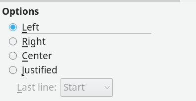 Figure 1: LibreOffice Writer offers four alignment choices.
Right Alignment
Aligning letters to the right margin is used the least. Right alignment is used only in layout, such as a title page. A basic rule of layout is that related information, such as the lines of a mailing address should have a common alignment. For instance, an address on a letter is traditionally right aligned. You often find a right alignment on a brochure or diagram as well. Generally, though, only a few lines in a document are likely to have a right alignment, for the simple reason that most European languages read from left to right, and an uneven left margin is harder to read and just looks wrong to most people.
[...]
Buy Linux Magazine
Subscribe to our Linux Newsletters
Find Linux and Open Source Jobs
Subscribe to our ADMIN Newsletters
Support Our Work
Linux Magazine content is made possible with support from readers like you. Please consider contributing when you’ve found an article to be beneficial.

News
-
Substantial Update to IPFire Now Available
The lastest version of IPFire features a fundamental change to how the system handles DNS.
-
Gnome Working on Test Center App to Make Testing Easier
It's now possible to test experimental features on the Gnome desktop without worrying that you'll break things.
-
New Vulnerability Discovered in Linux Kernel
Hiding out for nearly 15 years, the Ghostlock vulnerability allows a standard logged-in user to gain root privileges.
-
New Linux Flaw Lets Attackers Escape VMs
A 16-year-old vulnerability allows an attacker to escape a virtual machine, gain access to the host, and execute malicious code.
-
Hannah Montana Linux Is Back!
Developer Noah Cagle decided the world needed the once obscure but beloved Linux distribution and gave it a decidedly pink refresh.
-
System76 Refreshes the Lemur Laptop
If you're looking for a laptop with tons of power and battery, look no further than the latest iteration of the System76 Lemur Pro.
-
More than 43 Million Lines of Code in Linux Kernel 7.2
Using the cloc utility, Michael Larabel of Phoronix discovered that Linux kernel 7.2 has over 43 million lines of code.
-
Kubuntu Focus Goes Ultra
The Kubuntu Focus team has upped the performance ante of its M2 and Zr laptops with the latest, greatest CPUs from Intel.
-
Linux Gamers May Soon See Less Mouse Lag in KDE Plasma
Gamers using KDE’s Plasma desktop have been suffering from a slight input delay in mouse movement that could lead to getting fragged.
-
Three Lines of Code Improve Linux Storage Performance
A developer changed three lines of code, giving Linux storage performance a 5% bump.