
caliber: a battleground for function versus form

Off the Beat: Bruce Byfield's Blog
Because of my experience with graphic design, I like to think that an application's layout matters as much as its design. However, the release last week of calibre 1.0 challenges my outlook. As a regular user, I'm pleased to see this milestone, but it's definitely a triumph of features over design.
Calibre is one of those comprehensive applications that I associate with what's best in free software. Its development goal appears to be to place everything you could possibly need to deal with ebooks into a single window. Not only does the project add drivers in a matter of weeks for new devices and firmware releases, but it also includes a comprehensive list of options for every task. Cataloging, viewing, converting ebook formats, listing ebook sites, including its own DRM-free portal -- calibre seemingly has it all. So far as I know, no other ebook manager comes close to calibre, especially not those that manufacturers of tablets and ebook readers ship. No question: its feature list puts calibre in the same category of apps like k3b, digikam, and Amarok.
Yet the design of calibre is distinctly lacking. I'm not talking about the fact that the app signals the project each time that you start it, although if I ever stop using calibre, it will probably be because of that unnecessarily invasive practice.
Instead, what I am concerned with here is the interface itself. Frankly, the design is a mess -- a throwback to the mid-Nineties, when developers were just recognizing the need for an interface, but reluctant to spend time on designing it.
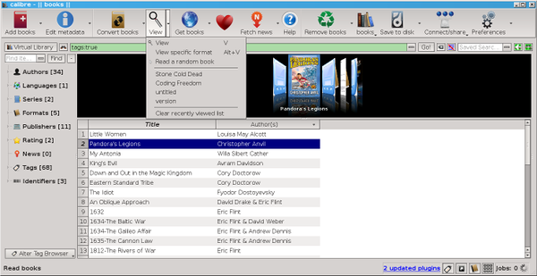
The main part of the window, sensibly enough is devoted to a list of books.But the space around it is used carelessly, with a side-pane listing views that could easily be placed into tabs, and the top -- almost a quarter of the windows' height -- devoted to a meaningless graphic that adds nothing to the functionality. Moreover, if you open the windows to a size at which you can see everything on the toolbar, at least half the width of the list of books is blank space.
But it gets worse. For no useful reason, calibre avoids menus altogether. Instead, all the major features are on a toolbar. Since there are over a dozen toolbar buttons, the only way to view them all at the same time is to expand the wndow to at least three quarters the width of a wide screen monitor.
To complicate matters to an even greater extent, the arrangement of items on the toolbar is random. It is not even alphabetical order. It does group icons by using separators, but the groupings are only intermittently logical. Add books and Remove books are separated by seven buttons, and Help in the middle of the toolbar rather than its traditional position on the far right. Apart from the placement of Preferences on the far right, it is as though the developers of calibre have never even heard of the conventions for arranging features in a graphical interface.
Adding to the confusion is the fact that some buttons have both a default behavior and a sub-menu ranging from a few items to a full-screen view, while others have only the sub-menu. The only way to tell which is which is to click the button.
As for the sub-menus, their items are at least grouped with some sort of consistency, but the listings are so verbose that they slow navigation to a crawl.
Despite the faults
What is odd about this sloppiness is that it should be an utter disaster. Quite simply, caliber's design is not user-friendly, and is simply inexcusable in a 1.0 release. In an alpha or early beta, inattention to design is excusable (although still not ideal), but a general release creates the expectation of some polish. According to any design theory, caliber's design is so poor that it should be a monstrous failure.
Yet, somehow it isn't.
It's not that familiarity breeds resignation. After three years of regular use, I still find myself stumbling through the toolbar, wasting time just finding the functions that I want.
But the fact is, the list of features is so complete that I always find myself enduring the design. Calibre does not entice me as user, and it certainly does very little to help me navigate, yet its features are so complete that I endure. However grudgingly, it lets me do everything that I need or want.
Against all my training in a design, I am forced to conclude that design is over-rated. Yes, quality design can enhance a feature set, and improve efficiency. Yet the common cry of the untrained user -- "I just want to get things done" -- proves truer than I would have imagined.
There is no reason why you can't have both good design and functionality. The two are not mutually exclusive. However, to my mind, calibre proves that if I have to choose between the two, I'll take functionality over design any day. It's a conclusion that design theory tends to overlook.
comments powered by DisqusSubscribe to our Linux Newsletters
Find Linux and Open Source Jobs
Subscribe to our ADMIN Newsletters
Support Our Work
Linux Magazine content is made possible with support from readers like you. Please consider contributing when you’ve found an article to be beneficial.

News
-
Is AI Coming to Your Ubuntu Desktop?
According to the VP of Engineering at Canonical, AI could soon be added to the Ubuntu desktop distribution.
-
Framework Laptop 13 Pro Competes with the Best
Framework has released what might be considered the MacBook of Linux devices.
-
The Latest CachyOS Features Supercharged Kernel
The latest release of CachyOS brings with it an enhanced version of the latest Linux kernel.
-
Kernel 7.0 Is a Bit More Rusty
Linux kernel 7.0 has been released for general availability, with Rust finally getting its due.
-
France Says "Au Revoir" to Microsoft
In a move that should surprise no one, France announced plans to reduce its reliance on US technology, and Microsoft Windows is the first to get the boot.
-
CIQ Releases Compatibility Catalog for Rocky Linux
The company behind Rocky Linux is making an open catalog available to developers, hobbyists, and other contributors, so they can verify and publish compatibility with the CIQ lineup.
-
KDE Gets Some Resuscitation
KDE is bringing back two themes that vanished a few years ago, putting a bit more air under its wings.
-
Ubuntu 26.04 Beta Arrives with Some Surprises
Ubuntu 26.04 is almost here, but the beta version has been released, and it might surprise some people.
-
Ubuntu MATE Dev Leaving After 12 years
Martin Wimpress, the maintainer of Ubuntu MATE, is now searching for his successor. Are you the next in line?
-
Kali Linux Waxes Nostalgic with BackTrack Mode
For those who've used Kali Linux since its inception, the changes with the new release are sure to put a smile on your face.