Aligning Text in LibreOffice Writer
Ducks in a Row

© synell, 123RF.com
To get professional publishing results, here are a few tips and tricks to get the most out of LibreOffice Writer’s alignment options.
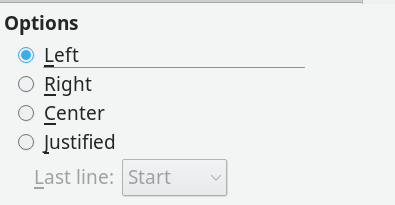
Just because an option in LibreOffice Writer is easy to choose does not mean that it is easy to use. Take, for example, alignment, or how characters are arranged between the left and the right margin on a line. A single click on the Alignment tab of a paragraph style will set the alignment to right, center, left (ragged right), or justified (i.e., evenly distributed between the margins). Yet to use any alignment takes design knowledge and, sometimes, extra effort as well (Figure 1).
Right Alignment
Aligning letters to the right margin is used the least. Right alignment is used only in layout, such as a title page. A basic rule of layout is that related information, such as the lines of a mailing address should have a common alignment. For instance, an address on a letter is traditionally right aligned. You often find a right alignment on a brochure or diagram as well. Generally, though, only a few lines in a document are likely to have a right alignment, for the simple reason that most European languages read from left to right, and an uneven left margin is harder to read and just looks wrong to most people.
[...]
Buy Linux Magazine
Subscribe to our Linux Newsletters
Find Linux and Open Source Jobs
Subscribe to our ADMIN Newsletters
Support Our Work
Linux Magazine content is made possible with support from readers like you. Please consider contributing when you’ve found an article to be beneficial.

News
-
Microsoft Issues Warning About Linux Vulnerability
The company behind Windows has released information about a flaw that affects millions of Linux systems.
-
Is AI Coming to Your Ubuntu Desktop?
According to the VP of Engineering at Canonical, AI could soon be added to the Ubuntu desktop distribution.
-
Framework Laptop 13 Pro Competes with the Best
Framework has released what might be considered the MacBook of Linux devices.
-
The Latest CachyOS Features Supercharged Kernel
The latest release of CachyOS brings with it an enhanced version of the latest Linux kernel.
-
Kernel 7.0 Is a Bit More Rusty
Linux kernel 7.0 has been released for general availability, with Rust finally getting its due.
-
France Says "Au Revoir" to Microsoft
In a move that should surprise no one, France announced plans to reduce its reliance on US technology, and Microsoft Windows is the first to get the boot.
-
CIQ Releases Compatibility Catalog for Rocky Linux
The company behind Rocky Linux is making an open catalog available to developers, hobbyists, and other contributors, so they can verify and publish compatibility with the CIQ lineup.
-
KDE Gets Some Resuscitation
KDE is bringing back two themes that vanished a few years ago, putting a bit more air under its wings.
-
Ubuntu 26.04 Beta Arrives with Some Surprises
Ubuntu 26.04 is almost here, but the beta version has been released, and it might surprise some people.
-
Ubuntu MATE Dev Leaving After 12 years
Martin Wimpress, the maintainer of Ubuntu MATE, is now searching for his successor. Are you the next in line?

