Creating charts with LibreOffice Calc

Plotting and Data Visualization

Article from Issue 260/2022
Author(s):

Everybody needs charts sooner or later, and LibreOffice Calc is the easiest way to create them with free and open source software.

Modern life is full of numbers. Even if one is not a mathematician, sooner or later comes the day when it's necessary to quickly understand or share with others the relationships among numbers. This tutorial introduces what is probably the simplest way to do just that with free software, the charts in LibreOffice Calc [1]. But are they charts or graphs? Let's clear up that question first.

Charts vs. Graphs

Both charts and graphs are tools to summarize and present information in a visual way. While most people use the two terms as if they were synonyms, strictly speaking, they aren't [2]. Some of the reasons are shown in Figure 1, but basically charts summarize datasets in ways that are (hopefully) intuitive and engaging, for example, with bars, pies, or other symbols. The primary purpose of charts is to convey the high-level meaning of data and the connections within it.

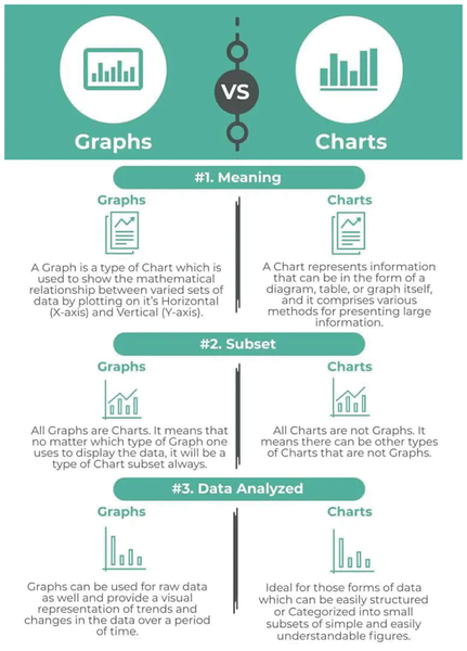
Figure 1: All graphs are charts, but not all charts are graphs [2].

Graphs, instead, are the subset of charts specifically designed to show the actual mathematical relationship between raw numeric data points. Another way to express the difference may be that charts are better for business presentations or, in general, any high-level description of (not necessarily numeric!) data, whereas actual analyses of numeric formulas would require graphs.

In practice though, that distinction can often be quite hard to figure out, let alone apply. For most users the semantic differences above will likely matter much less than figuring out what kind of Calc chart style best fits their needs (more on this later). Therefore, because LibreOffice Calc calls its data visualizations "charts," I will only use that term from now on.

Because charts can only display already existing data, you first need to learn how to quickly fill lots of Calc cells with numbers to play with. Indeed, this is a trick well worth learning regardless of charts because it provides the raw material through which you can learn any function of any spreadsheet.

As an example, say I want to visualize the number of downloads of three different versions of a generic Linux distribution in the first 30 days after its release. This requires a spreadsheet table like the one shown in Figure 2, where days from release and numbers of different daily downloads are arranged in columns, with labels in the topmost cells of columns 2-4 to identify each distribution version.

Figure 2: A table with labels and data can be quickly created with Calc's Fill Cell functions.

I generated the leftmost column in Figure 2 by typing 1 in the second cell and then dragging the bottom right corner of that cell down for 30 rows. When you do this on a cell containing integer numbers or dates, Calc fills the underlying columns with incremental values of the same type. The other three columns in Figure 2 were all created by selecting Sheet | Fill Cells | Fill Random Number in the main menu of Calc, which opens the pop-up window shown in Figure 3. The Fill Cells submenu has many more options, but here I selected the random generator of Uniform Integers, each time with equally random minimum and maximum values.

Figure 3: The Random Number Generator in LibreOffice Calc is used to filled the table in Figure 2.

Step-by-Step Chart Creation

Once the data is available, you can begin creating a chart: Select all the cells you want to visualize, headers included, and choose Insert | Chart in the main menu. This starts the four-step chart wizard shown in Figures 4 through 7.

In the first panel (Figure 4), you choose which kind of chart you want and set all of the options available for it. While it only takes a few clicks, this may very well be the most difficult step to get right.

Figure 4: Choosing a chart type looks easy, but it may be the hardest part of the chart creation process.

One reason for this is that the right chart type to use depends heavily on both the actual nature of your data and on what, exactly, you want to see, learn, and tell others through that specific chart. It's not uncommon to create multiple, wildly different charts from the very same set of numbers, each illustrating one distinct issue.

The other reason is that creating a chart can be harder than necessary if the columns and rows of data aren't already all close to each other and in the right order when you first realize you may want to use them in a chart.

Never rush to the chart wizard when you need a chart. Instead, first draw a sketch of what your chart should look like on paper, trying different types until you are happy with the result. Then return to your spreadsheet. If data isn't already grouped in the best way for drawing the chart you want, rearrange it accordingly.

You should, for example, recognize which data is actual raw numbers to plot and which data isn't really numbers (as far as the chart is concerned, at least), but labels for data categories. One example of the last kind is a column that contains years of birth, which in the chart will be used only to classify and distinguish different age classes. If rearranging is not possible, however, don't despair. I will show how to deal with such cases in a moment.

Correct grouping of data in the spreadsheet makes chart creation faster but may still tell little or nothing about which chart type should be chosen. The chart type to use depends on what kind of relationship there is between the data.

To understand this, consider a table with just two columns. If the relationship between the data in the two columns is biunivocal – that is (real mathematicians, forgive me for this approximation!), if each value in the first column corresponds to one and only one unique value in the second column (for example, the maximum temperature on each day of the current year) – then a line chart may very well be the best choice. If, instead, there is more than one value on the y-axis for any given x-axis value, a scatter graph would probably be much better.

This said, I strongly suggest only playing with line charts until you have become familiar with all the settings of the chart wizard. Afterwards, it will be much easier to master the other chart types and, above all, to make charts that communicate well, rather than merely trying to impress friends or colleagues.

The second and third panels of the wizard are where you configure the Data Range (Figure 5) and the Data Series (Figure 6), respectively, of your chart. The first term indicates the complete set of cells that contains all the data to plot or use as labels in the chart. A data series, instead, is one single subset of data inside that range, which generates one separate subplot in the chart.

Figure 5: Data ranges are easy to load in the chart wizard, if they were carefully prepared beforehand!
Figure 6: If the data range was prepared properly, the chart wizard recognizes both the data and labels by itself.

By default, the data range loaded by the wizard will correspond to all the cells you selected with the mouse before launching the wizard itself. In my example, those cells constitute the rectangle of 31 rows by 4 columns partially shown in Figure 2. The wizard identifies that rectangle by listing its top left and bottom right corners, each in the $SHEET$COLUMN$ROW format, joined by a colon.

The data range shown in Figure 5 means "everything from cell B109 of Sheet 1 to cell E139 of the same sheet," which, as you can quickly check for yourself, is exactly 31 rows by 4 columns. What really matters here is that you can define the data range as you want by writing it yourself in the Data range field in Figure 5, or by clicking on the button to its right (not shown in Figure 5), to select it with the mouse.

Even better, you can group non-contiguous "sub-ranges" (e.g., two separate areas of the spreadsheet) by entering their coordinates in the format above, one at a time. The sub-ranges must be separated by Calc's "appropriate delimiter," the default value of which in almost all locales is a comma. To check or change your range delimiter, go to Tools | Options | LibreOffice Calc | Formula, and look in the Array Column field.

The other, equally important operation to do in the Data Range panel is to specify whether the first row or column of the whole data range should be used in the chart as labels, or independent coordinates, for the other data. If you don't specify, Calc will treat the first row or column as just one more set to plot alongside all others.

Figure 5 shows what happens if you select the data range of Figure 2, with the first row and column each marked as labels for the other data. This makes the wizard recognize the leftmost column (i.e., cells from B109 to B139) as a "category" that must not be plotted by itself but used as the independent coordinate on the x-axis. For the other three columns, marking the top row as labels assigns the names in each of the top cells to, respectively, the columns' three distinct data series.

Figure 6 contains several other important pieces of information. One is that in Calc (confusingly, if you ask me) the numbers inside each data series are called, again, the data range of that series. The good part is that you may enter the actual range of any series in the same way as the whole data range, by typing it in the corresponding text field.

Another important element hidden in plain sight in Figure 6 becomes evident when you compare it with Figure 4: Each data series has different configuration options that depend on the chart type selected in the first panel. In Figure 6, you can set Border Color, Fill Color, Name, and the actual data (Y-Values) for each series, because those are the options available for the Column chart type that was set in Figure 4. Had I chosen Line, instead, Figure 6 would show only the parameters that make sense for a line diagram – the Y-Values to plot and the Name of the resulting line.

Last but not least, note the Add, Remove, and arrow buttons in Figure 6. Yes, you can change the order in which the series is placed in the chart, without reshuffling the corresponding rows or columns in the spreadsheet. You can also remove whole series (again, just from the chart, not from the spreadsheet!), or add entirely new ones, by entering their range as already explained.

The last panel of the wizard (Figure 7) is probably the easiest. This is where you set the chart's descriptive "metadata," that is, title, subtitle, axes labels, and legend. The final result of all this work is shown in Figure 8. The x-coordinates, what Calc calls "category," are unreadable, but no problem! In Calc, you can always double-click on an existing chart to enter an "Edit Mode" in which you can select any element and then right-click on it (or choose Format in the top menu) to reopen the corresponding section of the wizard. Doing just that on the x-axis opened the panel in Figure 9, in which I rotated the text to make it readable, as shown in Figure 10!

Figure 7: The last panel of the chart wizard lets you enter titles and select legend and grid settings.
Figure 8: The histogram resulting from the data and settings shown in the previous figures still needs some work.
Figure 9: If the labels on the axes are too crowded, rotate them!
Figure 10: The same labels seen in Figure 8 are much more readable now.

Before continuing, let's go back to Figure 8 to learn a little more chart terminology. The main rectangle that contains everything else is the chart wall, and whatever you put as background is the chart area. Three-dimensional (3D) charts will also have a chart floor. You may load any image you want for the chart area, including photographs, though this is almost never a good idea. Unless you have a really good reason to do it in the first place and choose very carefully both the image and the colors of the diagram, the result will often be much harder to read. The same consideration applies to many of the most esoteric options of Calc charts. More often than not, resisting the urge to use them will make your chart better.

That said, there are other Calc functions that are important to know because they may make many of your charts better. The first of such functions is a must whenever you need to show, within the same chart, two data series that have different units or very different scales. What if, for example, one series varied between 0 and 1,000 and the other only between 0 and 30? Plotting them with just one vertical axis would make the second series almost invisible!

The solution, applicable only after the chart has been created, is to double-click on the chart, click on one of the two series that appears, and then go to the Options tab shown in Figure 11. Then, to align that series, select Secondary Y axis to obtain a result like shown in Figure 12, which shows two lines in full detail thanks to the fact that each of them has its own axis adapted to its range.

Figure 11: Another option that makes charts much more readable is the addition of a secondary y-axis.
Figure 12: The extra y-axis on the right gives both lines a comparable scale, thus making both of them more readable.

Another area that can greatly increase the clarity of a chart is coloring, a term I use here to indicate three distinct options: To begin with, you can change the color that Calc assigns to each data series by selecting the color inside the chart, right-clicking on it, and choosing Format Data Series. To change the default colors for all your charts, instead, go to Tools | Options | Charts | Default Colors. The most interesting coloring you might do in LibreOffice charts, however, is based on conditional formatting. This means, for example, giving each bar in a histogram a different color depending on whether the corresponding numeric value meets certain conditions. For a very detailed explanation of this technique, see the "Creating Charts with Conditional Formatting" tutorial [3].

LibreOffice v7.2 has improved a function that, while useless for many users, is a must-have for users who do statistical analyses. The panel shown in Figure 13 – which opens when you select a data series in the chart and click on Insert Trend Line – now supports more types of moving average (Figure 14).

Figure 13: A welcome addition in LibreOffice Calc 7.2 is more options for the moving average trend line.
Figure 14: A moving average trend line (blue) has been added to the chart by using the options shown in Figure 13.

The last function for making great Calc charts (like using pictures for chart walls) is very easy to misuse: 3D charts. The readability of a 3D chart depends a lot on proper lighting and orientation, and Calc makes it very easy to optimize these. Once the 3D chart has been created, double-click on it and select Format | 3D View to open an interactive panel with three very intuitive tabs in which you can easily try and set different values for those parameters (Figure 15).

Figure 15: 3D charts can be great, but only if they have the right lighting, orientation, and colors.

Next Steps

This tutorial contains all the basic definitions and concepts you need to get started as a serious chart designer with LibreOffice 7.2 or later. If you make sure you really understand the foundation explained here, then practicing Calc's many charting options will be much faster and easier than if you had started from scratch. Happy charting!

The Author

Marco Fioretti (http://mfioretti.com) is a freelance author, trainer, and researcher based in Rome, Italy. He has been working with free/open source software since 1995 and on open digital standards since 2005. Marco also blogs about digital rights at https://stop.zona-m.net.

Buy this article as PDF

Express-Checkout as PDF
Price $2.95
(incl. VAT)

Buy Linux Magazine

SINGLE ISSUES
 
SUBSCRIPTIONS
 
TABLET & SMARTPHONE APPS
Get it on Google Play

US / Canada

Get it on Google Play

UK / Australia

Related content

comments powered by Disqus
Subscribe to our Linux Newsletters
Find Linux and Open Source Jobs
Subscribe to our ADMIN Newsletters

Support Our Work

Linux Magazine content is made possible with support from readers like you. Please consider contributing when you’ve found an article to be beneficial.

Learn More

News